Product work with the reasoning behind it. I come to design from the engineering side, so each case study covers the problem, how I explored it, the decisions that mattered, and what shipped. AI tools are part of every process here, from exploring layout directions to building working prototypes early enough to test.
01
Ovation
March – May 2026 · UChicago entrepreneurship program
Engineering lead, feed and interaction design
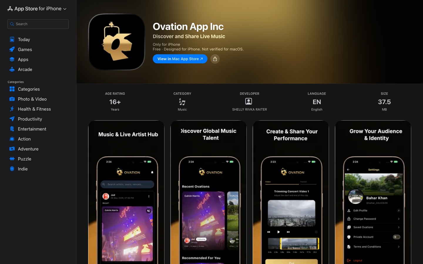
A social video app for live music, shipped to the App Store by a small student team.
Concertgoers record clips they never share because every existing feed buries them. Ovation needed a vertical feed that felt as fast as the big apps while working on a student budget and a flaky venue network.
Process
Scoped the MVP to four screens: feed, record and trim, profile, and search. Everything else was cut or deferred.
Prototyped the feed in Flutter within the first week and put builds in front of classmates at actual shows to watch what they scrolled past.
Ran weekly sprints, split work between the Flutter client and Django backend, and reviewed every merge before it shipped.
Decisions that mattered
Optimistic UI everywhere a user acts: likes, follows, and uploads appear instantly and roll back with a quiet toast if the request fails, because venue Wi-Fi drops mid-tap.
Tag-based discovery over a pure algorithmic feed, so a new user with no history still lands on something relevant to the artist they just saw.
Multipart upload with trim-before-upload, so a two-minute clip never blocks the UI and users see progress on the exact segment they chose.
Outcome
Shipped to the App Store as a free download. The feed, upload pipeline, encrypted messaging, and push notifications all made the release.
Design, build, and brand system, with AI-assisted prototyping
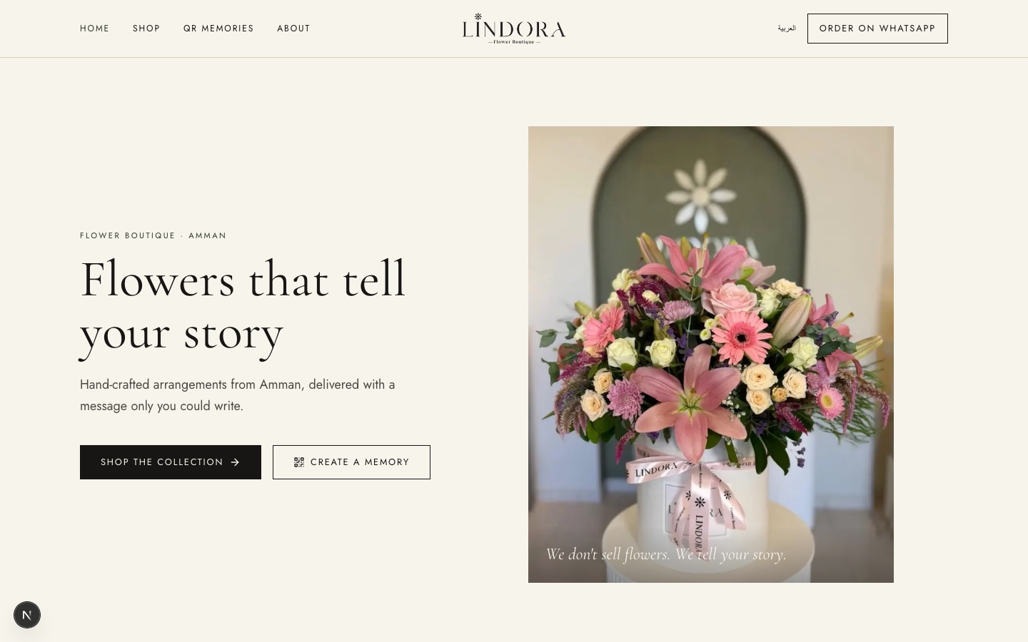
An online shop and ordering flow for my family's flower boutique, bilingual in English and Arabic, built around how customers already order: on WhatsApp and Instagram.
lindora · local build, pre-launch
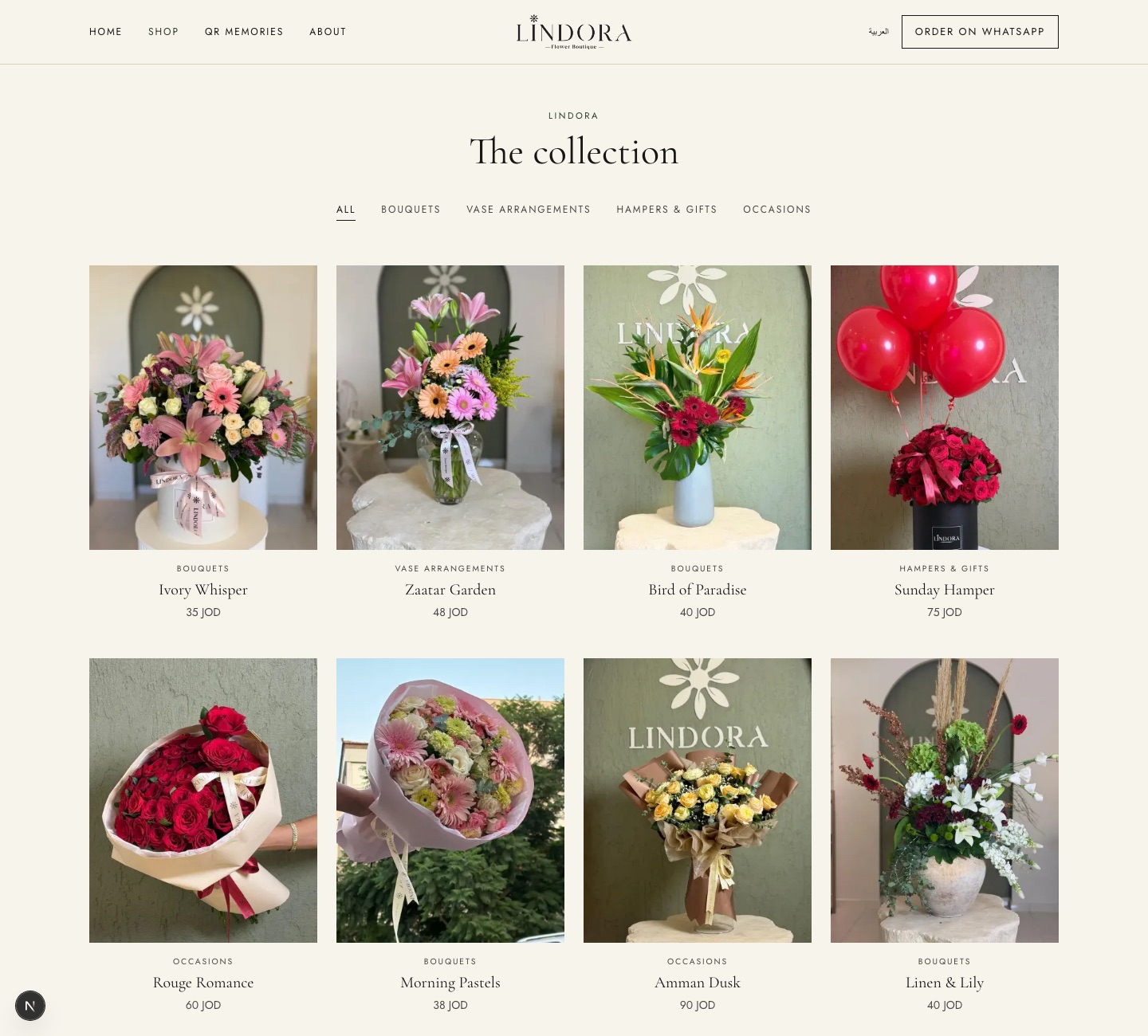
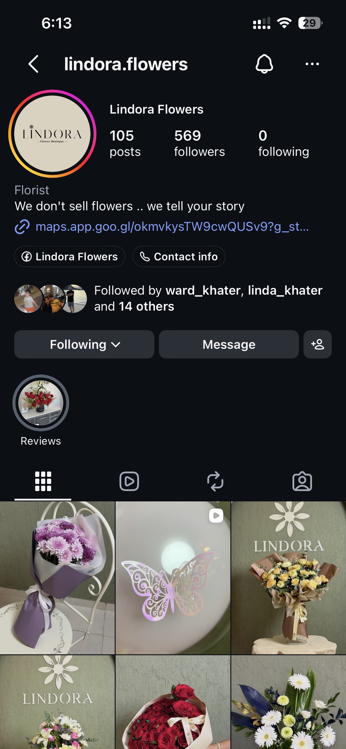
The collection, four across, photographed against the shop's sage wallThe Instagram grid the site had to feel continuous with
Problem
The boutique had 500-plus Instagram followers and took every order by DM or phone, which meant retyping addresses, chasing payments, and no record of what sold. It needed a site that looked like the shop, worked in Arabic, and did not ask customers to abandon WhatsApp.
Process
Started from the physical brand: the sage arch, the ivory boxes, the ribbon, the printed card. Built a small design system (type, palette, spacing) from those before touching a page.
Used AI tools to draft several homepage and product-page directions quickly, then reviewed them with my parents on their phones, since that is how their customers will see it.
Built the shortlist as working Next.js pages against a real product database, so every review was on real photos, real prices, and real Arabic type.
Decisions that mattered
WhatsApp is the checkout. An order composes a prefilled WhatsApp message with the items, address, and card text, because that is where the shop already lives and where trust already exists.
Full right-to-left Arabic, not a translation layer: mirrored layout, Arabic serif scaled up, and letter-spacing removed so the letters stay joined.
QR Memories: each arrangement can carry a QR code that opens a short video or voice note from the sender. The flowers are the product, but the message is why people buy them.
Photographs do the selling. The grid is quiet, four across, with one serif name and a price. Nothing competes with the arrangement.
Outcome
Catalogue, bilingual storefront, WhatsApp ordering, QR memories, and an admin panel for products, orders, and delivery areas are built and running. Launch is pending the shop's domain.
An AI-powered tool that reads a nonprofit founder's inbox, extracts what matters, and drafts replies she approves in one pass.
inbox → assistant → review → send
1 · inbound
Gmail webhook fires on each new message
2 · read
Gemini extracts sender, ask, dates, and urgency
3 · draft
A reply is drafted in the founder's voice
4 · review
She approves, edits, or discards. Only then it sends
Internal tool; screenshots contain client email and are not shown.
Problem
The founder of a criminal-justice nonprofit was spending hours a day on email, most of it routine: intake requests, volunteer questions, scheduling. She needed help without giving up control of a single message going out under her name.
Process
Shadowed a week of her inbox to sort mail into a handful of recurring shapes, then designed the tool around those shapes rather than around the model.
Built a first version that only extracted structured fields, no drafts, to earn trust before adding generation.
Iterated on the review surface with her directly: what she needed to see, in what order, to approve or edit in under thirty seconds.
Decisions that mattered
Human in the loop by design. Nothing sends without her tap. The draft is a starting point, never an action.
Show the extracted facts above the draft, so she checks the model's reading of the email before she checks its writing.
Queue drafts into the CRM she already used instead of a new inbox, so the tool added zero new places to look.
Outcome
Her time on email dropped by about 60 percent. The same platform went on to automate onboarding for 180+ staff and volunteers.
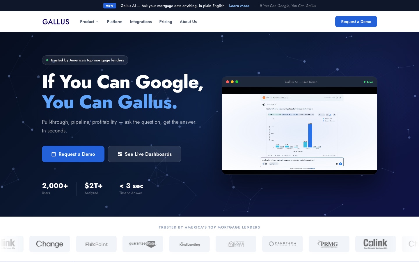
The public marketing site for a mortgage analytics company, designed and built during my data science internship.
www.gallusinsights.co
Problem
Gallus sells to mortgage lenders who are skeptical of dashboards. The site had to make a data product feel simple in one screen and get a visitor to a demo request without a scroll.
Process
Used AI tools to generate a dozen hero and layout directions in an afternoon, then narrowed to three to review with the founders.
Built the shortlist as working pages rather than mockups, so the review happened on real type, real spacing, and real load times.
Tuned copy and hierarchy with the sales team until the headline and the demo button were the two things a visitor saw first.
Decisions that mattered
One promise in the hero, 'If You Can Google, You Can Gallus', with the product shown live beside it instead of described.
Customer logos and three proof numbers directly under the fold, because lenders trust peers more than features.
Dark hero, light body, so the product screenshot reads as the brightest thing on the page.
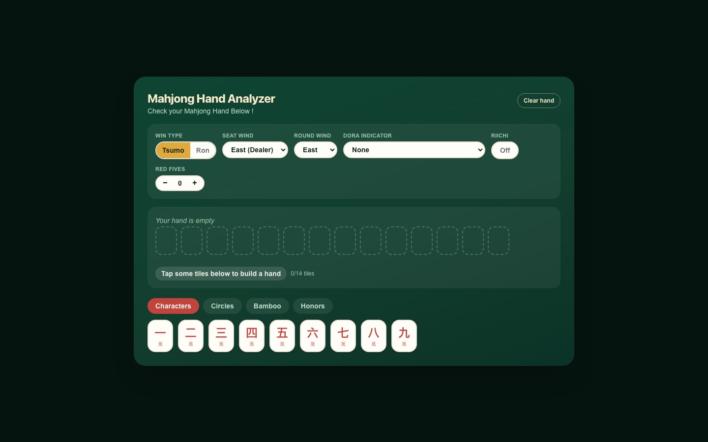
A Riichi mahjong hand engine written in C, compiled to WebAssembly, with a web front end a beginner can read at a glance.
mahjong-engine.vercel.app
Problem
Riichi scoring is famously opaque. Existing calculators assume you already know the terminology. I wanted one where a new player could tap tiles and understand why a hand does or does not win.
Process
Wrote the engine first: recursive block decomposition for win detection and a shanten search, all in C.
Designed the UI around the physical act of building a hand: tap tiles from a rack, watch them fill fourteen slots, get feedback as you go.
Tested with friends who had never played, and rewrote every label they asked about.
Decisions that mattered
Tiles grouped by suit with color-coded tabs, matching how a real rack is read.
Empty-state guidance inside the hand area, so the first screen tells you exactly what to do.
A single 34-byte count vector as the whole boundary between JS and C, which keeps the UI instant and the engine testable on its own.
Outcome
Live demo, open source, reachable from the shell on my homepage.
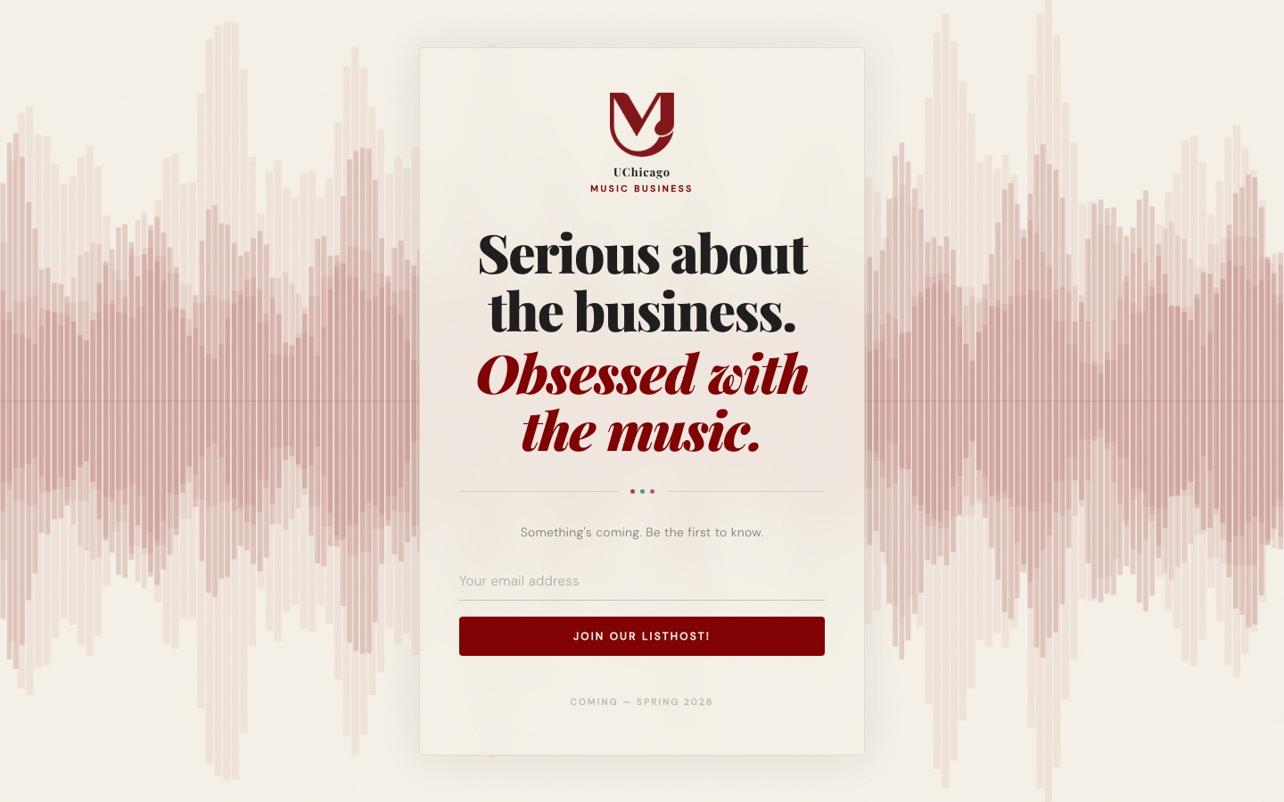
A launch page for a student music business organization, built to collect signups before the org went public.
uchicagombo.vercel.app
Problem
The organization had a name and a mailing list and nothing else. The page had to communicate a point of view and collect emails, with no content to lean on.
Process
Started from the two-line manifesto and designed outward from the type.
Tried several backgrounds before settling on a waveform that reads as music without a single photo.
Decisions that mattered
Serif display type in maroon and black, borrowing from UChicago's palette without copying its brand.
One field, one button. The page does exactly one thing.
Outcome
Live and collecting signups ahead of the Spring 2026 launch.